• About
  • Portfolio
  • Resume
  • Contact
Mark Woloschuk – Creative Director & Producer
  • About
  • Portfolio
  • Resume
  • Contact

SuperPro Kit

Featured
web-menmonics_05.png

Client: SuperPro Racing

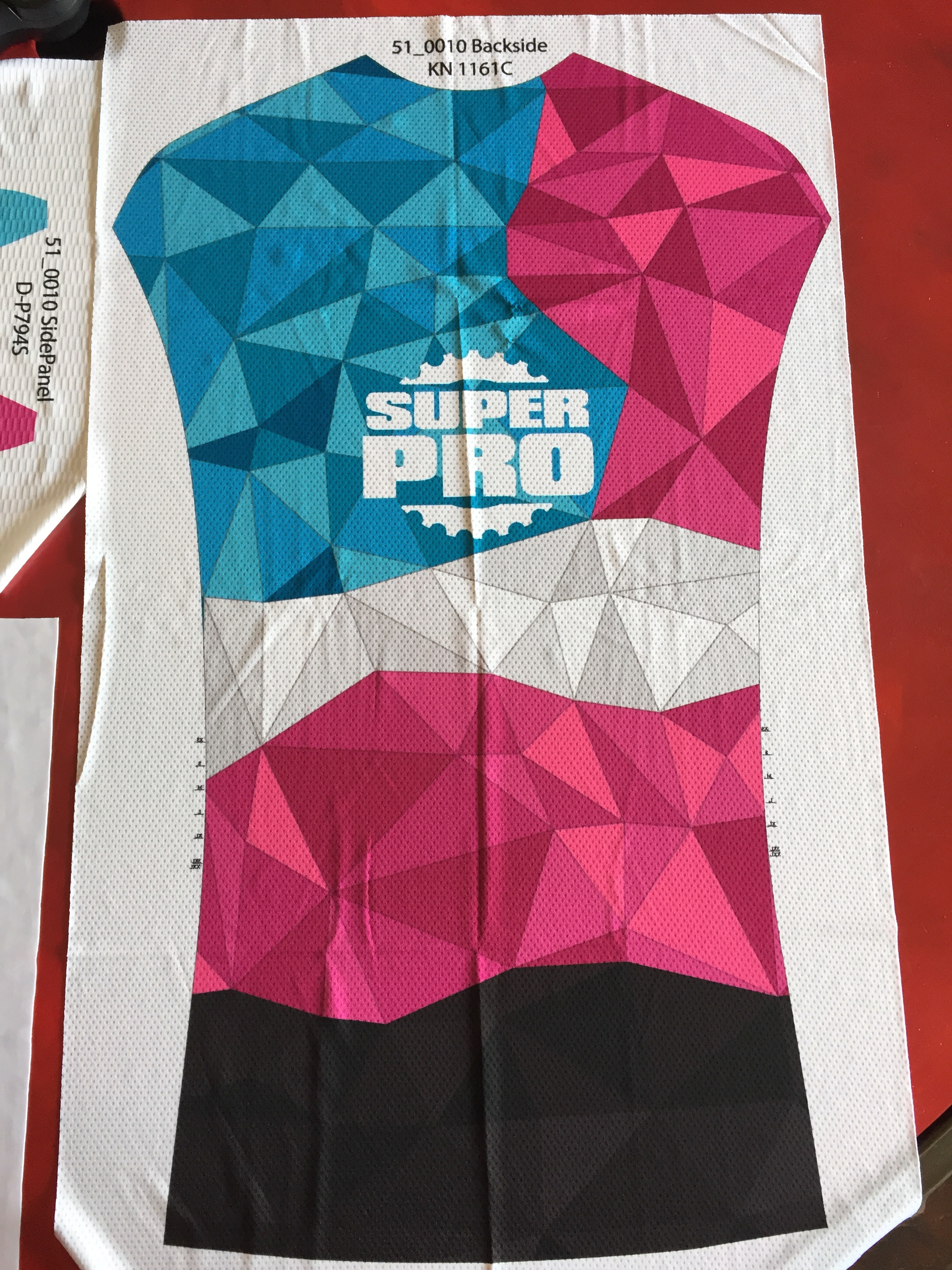
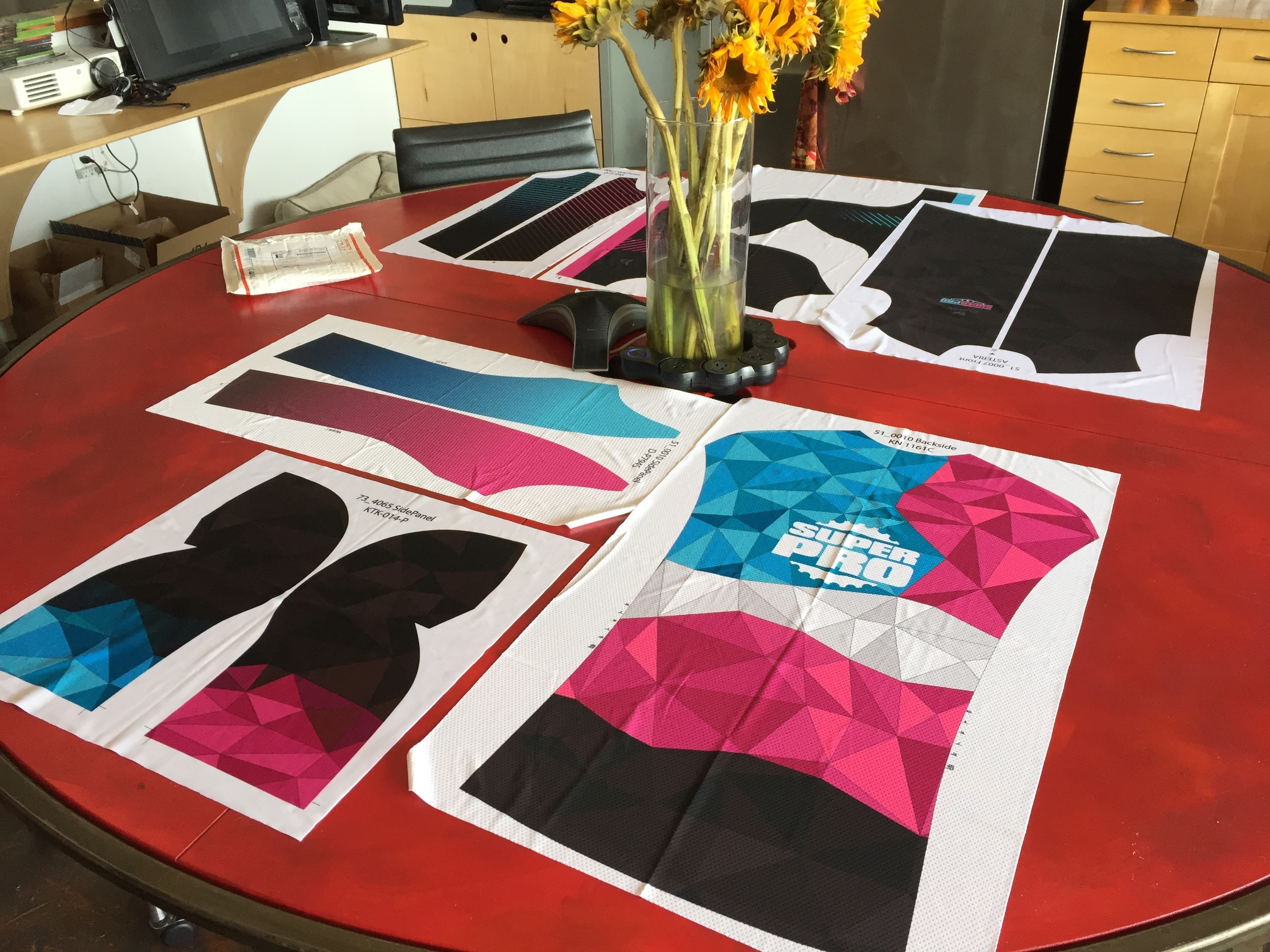
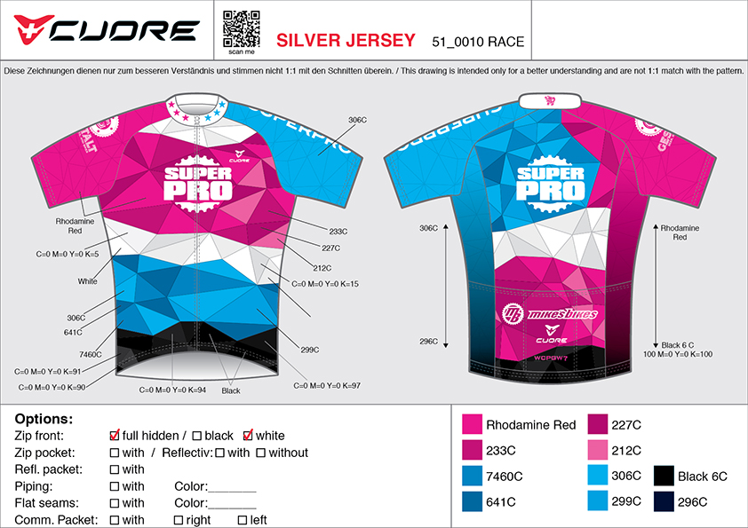
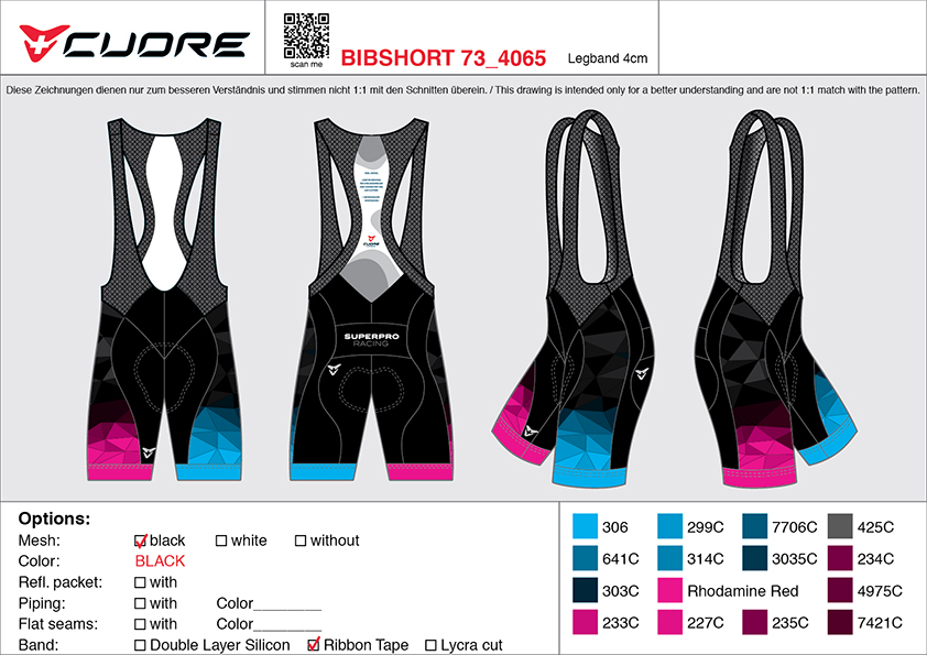
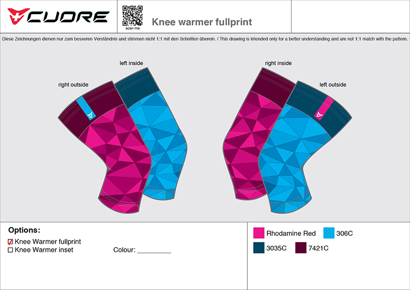
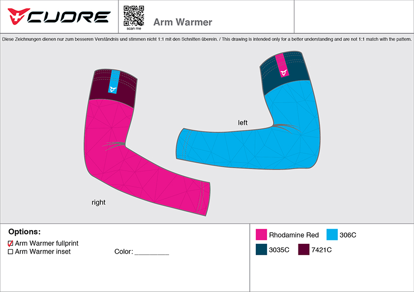
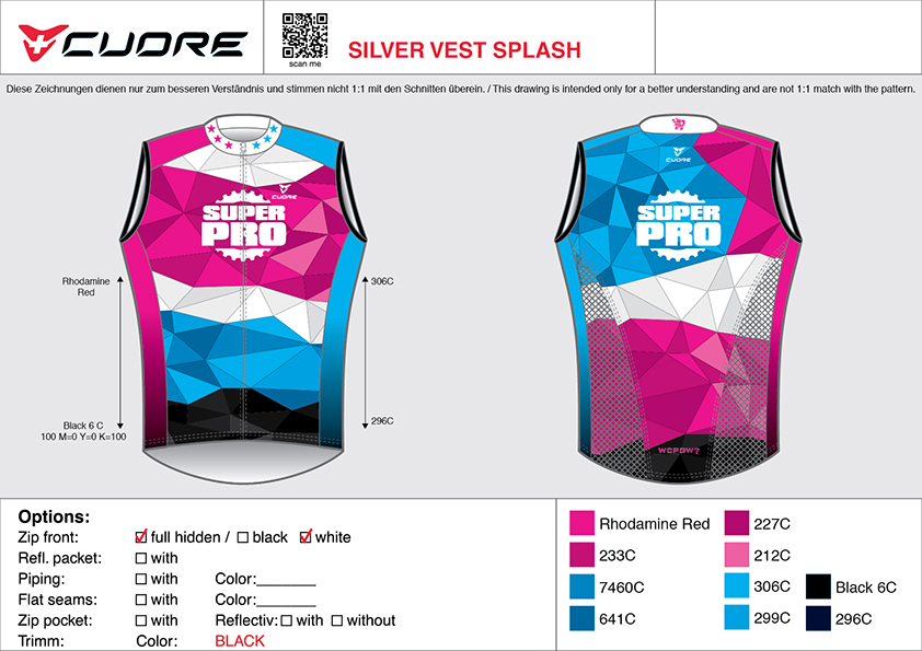
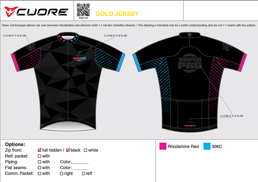
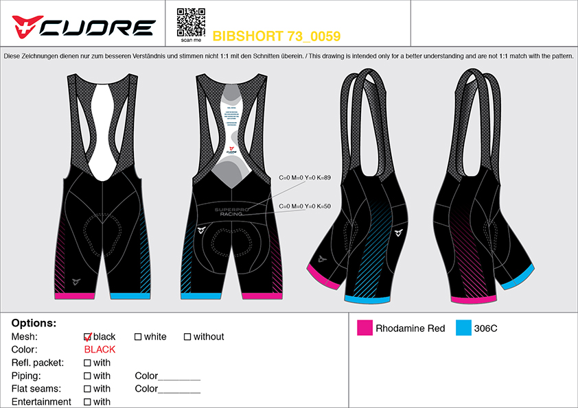
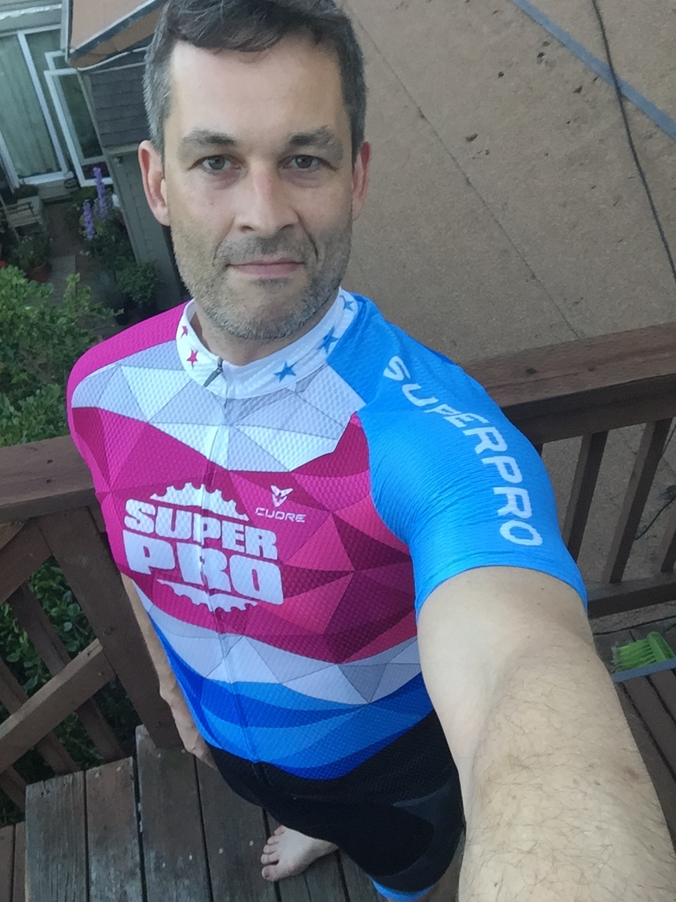
A cycling team’s kit is more than protection from the elements, it’s also a visual identity. In evolving the team’s identity, I aimed to express symmetrical asymmetry throughout.

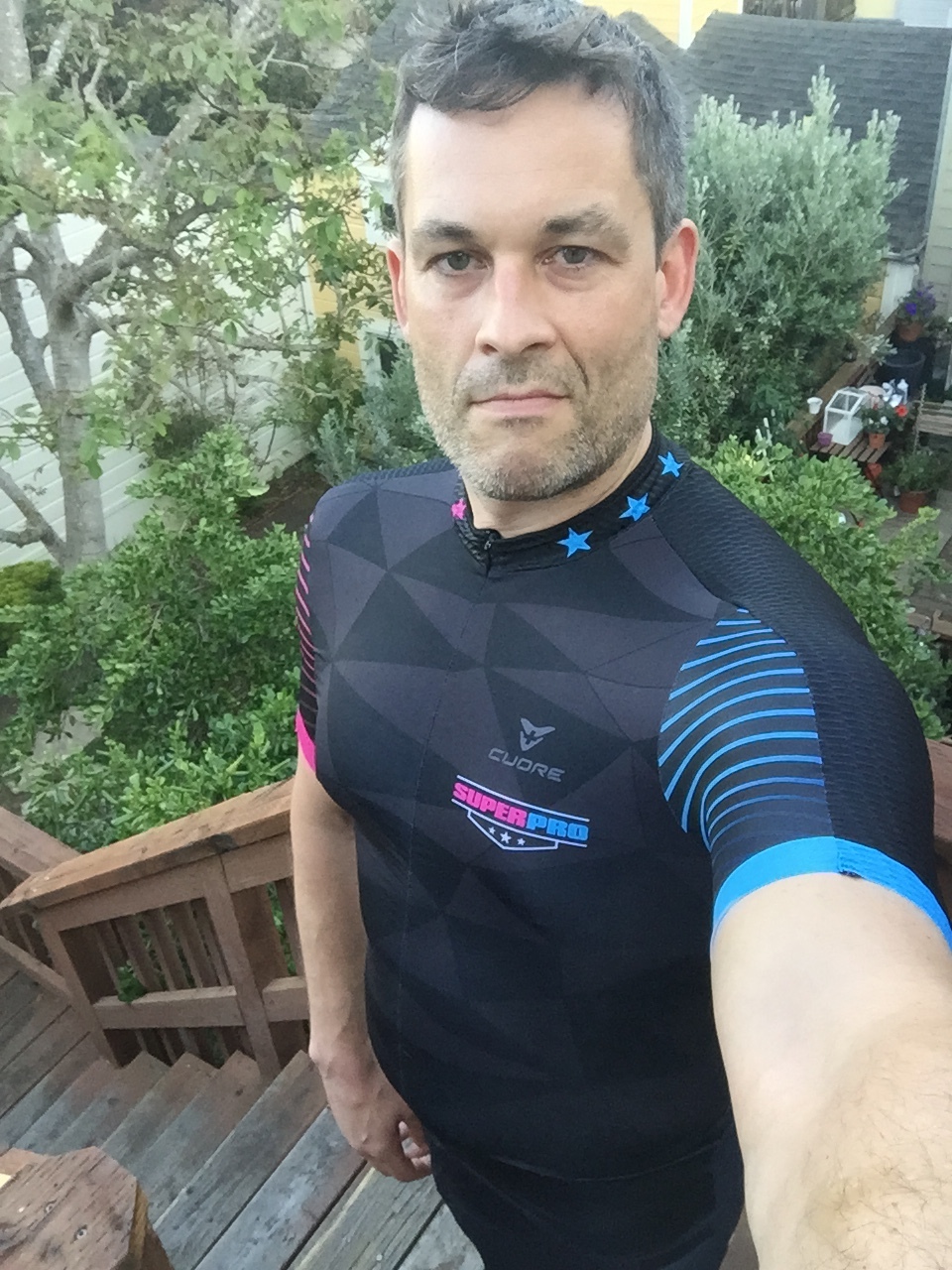
As the design evolved into its finished state, it also inspired the more subtle design for the training kit. Here the subtle dashes of color and triangle grid evoke the spirit of its more brash race-day cousin.

 
IMG_0221.JPG
IMG_0220.JPG
SPR S Jersey.jpg
SPR S 73_4065.jpg
SPR Knee Warmer full.jpg
SPR Arm_Warmer_full.jpg
SPR S Vest Splash.jpg
SPR New G Jersey.jpg
SPR G 73_0059.jpg
IMG_0312.JPG
IMG_0314.JPG
IMG_0221.JPG IMG_0220.JPG SPR S Jersey.jpg SPR S 73_4065.jpg SPR Knee Warmer full.jpg SPR Arm_Warmer_full.jpg SPR S Vest Splash.jpg SPR New G Jersey.jpg SPR G 73_0059.jpg IMG_0312.JPG IMG_0314.JPG
BACK
 

*But what the hell is this “shtooky” business all about then, eh?

If you’re going to cap’n the ship, you’d better learn to sail.

In the absolute center of things one is at once both everywhere and nowhere.

Picturesque, playful pixel patterns possess (postulate) perplexing philosophical power, promoting propitious perceptual phemonena, pleasing predominantly perspicacious persons’ palettes perfectly.

When 1 + 1 can equal more than 2.

Walking a 1 pixel line.

Get it write (har!) on paper.

Empathy, presence, humility, patience and an open mind - makes for a good start.

Everyone and everything is interesting… really!

To touch the heart and to caress the mind.

While I am not all things to all people, I am, nevertheless, many things to some.

Try to avoid falling down on top of the rattle snake and it’s offspring.

Call me normal, and I’ll call you often.